Electric Car Range Anxiety

A friend recently sent me an article entitled Couple has ‘range anxiety’ as electric vehicle requires 12 charging stops. I’ve written a number of blog posts now on how electric cars fail to really provide the green result that vendors claim, but I hadn’t thought about other aspects of actually driving an electric car until I read this article.

If you’re on a road trip and your main concern is finding some place to charge your vehicle, while you drive it without the heat on in the winter no less, then how much of a good experience can the Electric Vehicle (EV) really provide? Anxiety of any sort presents a health risk. So, not only is the EV a poor citizen from the green perspective, but it also presents a health risk to those who drive one. The article How Far Can an EV Go On One Charge? shows graphically that EV ranges have a long way to go to catch up with gas cars. Theoretically, in perfect conditions with a full charge and no extra usage (such as heat for the humans in the car), it’s actually unlikely that you’ll actually run out of power according to Electric America, yet the anxiety remains.

Articles like What is EV range anxiety and how can we overcome it? and Electric car range and 5 reasons why your range anxiety is unwarranted seek to reduce the anxiety. They point out that there are now plenty of charging stations and that the distances between charging stations is less than the distance that a EV can drive between charges. They also point out that the batteries have a longer life expectancy than most people think. However, the articles just don’t seem to be getting through to people who fear change and drive these vehicles in actual conditions where the mantra of what should work doesn’t actually match what is.

The best possible assumption is that your EV will run out of power on a road trip and to know what to do about it. Articles like What Happens if your Electric Car Runs Out of Battery? provide helpful information on what the ramifications are of running out of power and what you should do about them. It turns out that what you really need is a tow truck, which is the same thing that a gas powered car driver needs when running out of gas. Unlike a gas powered car, it’s also theoretically possible to turn an EV off and then restart it to get another mile or two out of the battery before it dies completely, which may be all you need to get to a charging station.

Even though I don’t see EVs as a way to reduce pollution effectively because they really are harmful to the environment in ways that gas powered cars aren’t, I must admit after doing research for this blog post that anxiety felt about running out of power is probably unwarranted. In this regard, even though the EV range is less than a gas powered car, they’re really both on equal footing. Let me know your thoughts about EVs at [email protected].

Review of The Kaggle Book

A picture of The Kaggle Book cover.
The Kaggle Book tells you everything needed about competing on Kaggle.

The Kaggle Book by Konrad Banachewicz and Luca Massaron is a book about competing on Kaggle. The introductory chapters tell you all about Kaggle and the competitions it sponsors. The bulk of the book provides details on how to compete better against a variety of adversaries. The book ends with some insights into how competing in Kaggle can help with other areas of your life. If the book ended here, it would still be well worth reading cover-to-cover as I did, but it doesn’t end here.

My main reasons for reading the book were to find out more about how data is created and vetted on Kaggle, and to obtain some more insights on how to write better data science applications. In the end, the bulk of this book is a rather intense treatment of data science with a strong Kaggle twist. If you’re looking for datasets and to understand techniques for using them effectively, then this is the book you want to get because the authors are both experts in the field. The biases in the book are toward data management, verification, validation, and checks for model goodness. It’s the model goodness part that is hard to find in any other book (at least, the ones I’ve read so far).

The book does contain interviews from other people who have participated in Kaggle competitions. I did read a number of these interviews and found that they didn’t help me personally because of my goals in reading the book. However, I have no doubt that they’d help someone who was actually intending to enter a Kaggle competition, which sounds like a great deal of work. Before I read the book, I had no idea of just how much goes into these competitions and what the competitors have to do to have a chance of winning. What I found most important is that the authors stress the need to get something more out of a competition than simply winning—that winning is just a potential outcome of a much longer process of learning, skill building, and team building.

You really need this book if you are into data science at all because it helps you gain new insights into working through data science problems and ensuring that you’re getting a good result. I know that my own person skills will be improved as I apply the techniques described in the book, which really do apply to every kind of data science development and not just to Kaggle competitions.

Checking SQL Server Status

This is an update of a post that originally appeared on November 14, 2012.

A number of my books rely on database access. Today that database access can take many forms, such as the use of .csv files in my AI, machine learning, and deep learning books. However, this post is specific to those books that use Microsoft’s SQL Server on the local system, which is currently limited to C++ All-In-One for Dummies, 4th Edition (optionally) and C# 10.0 All-in-One for Dummies, but could include other books in the future (or you may simply decide to use Microsoft SQL Server with one of my other books).

In order to access any server, the server must be running. It only makes sense that you can’t access something that isn’t listening. The problem is that SQL Server may not start automatically for a number of reasons on your system and that Visual Studio doesn’t always make it apparent that the server isn’t running. You may get a nebulous message when you try to make a connection that doesn’t tell you anything. (No, SQL Server doesn’t start automatically when you make a request for data.) With this in mind, a post of checking the status of SQL Server is important.

Normally, I would tell you to use the tools that come with SQL Server to check the status of the server. However, some versions of SQL Server Express Edition install without the standard tools now, such as SQL Server Management Studio (SSMS). Without access to these tools, it may seem as if checking the server status is impossible. Fortunately, you have other options.

The best way to check the status of SQL Server on your system is to use the Services console found in the Administrative Tools folder of the Control Panel. The Services console is one of a number of Microsoft Management Console (MMC) snap-ins that Windows installs automatically for you. However, to use this console, you must have administrator rights on the target system. Without these rights, you truly are out of luck in checking the status of your SQL Server setup and will need to get an administrator to help you.

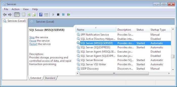
Open the Services console by right clicking Start, choosing Run from the menu, typing services.msc in the Open field, and clicking OK. You find a list of all of the services installed on your system in the resulting Services window. Scroll down the list and you should find one or more SQL Server entries like the ones shown here.

The services window contains a list of Windows services installed on the local machine that their status.
Use the Services console to check the status of services on your system.

In order to work successfully with the examples in my book, you should have SQL Server set to start automatically. In addition, when you check the service, you should see Started in the Status column as shown in the screenshot. If you don’t see Started, then highlight the service as shown and click the Start link you see on the left side (not shown in this case because the service is already started).

To make the examples easier to work with, you should also ensure that the SQL Server Browser service is started. This service makes it possible for Visual Studio to find the SQL Server installation on your system. Without this service, you must correctly type the name of the SQL Server installation you want to use when creating a connection, which is both time consuming and error prone.

If you find that you encounter problems making database examples in my books work, please check the status of SQL Server to ensure the service is actually started. Contact me at [email protected] if you experience any other connectivity problems. I may not be able to fix every problem you encounter, but I often have a good idea of what problems you might be seeing on your system and will do my best to help you.

Checking for Mobile Friendliness

This is an update of a post that originally appeared on January 6, 2016.

Is your application mobile friendly? It seems simple enough, but the answer can be very tough to come by. This whole concept of mobile device friendliness sometimes seem like an enigma wrapped in a Zen riddle. There is actually a difference between sites that are mobile friendly and those that are mobile responsive, in that a mobile responsive design does a lot more for the mobile users (and is always mobile friendly by default).

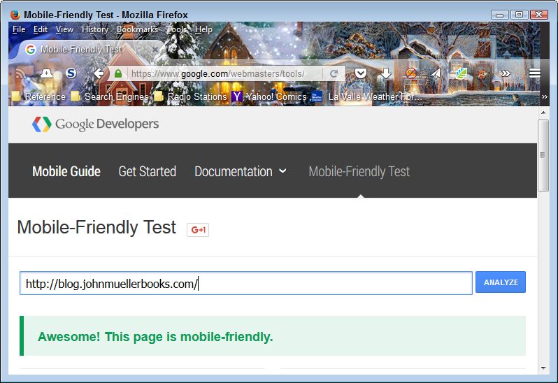
Most development tools today make a strong attempt at helping you create mobile friendly applications. In addition, new technologies and tools are helping developers create useful applications. Fortunately, vendors such as Google are now making it possible for you to verify that your site is mobile friendly with an easy to use check. All you need to do is point your browser to https://www.google.com/webmasters/tools/mobile-friendly/, enter an URL, and click Analyze. You get a quick answer to your question as shown here within a few seconds.

Verify that your site will support mobile users by performing a mobile friendly check.
Output from a Successful Mobile Friendly Check

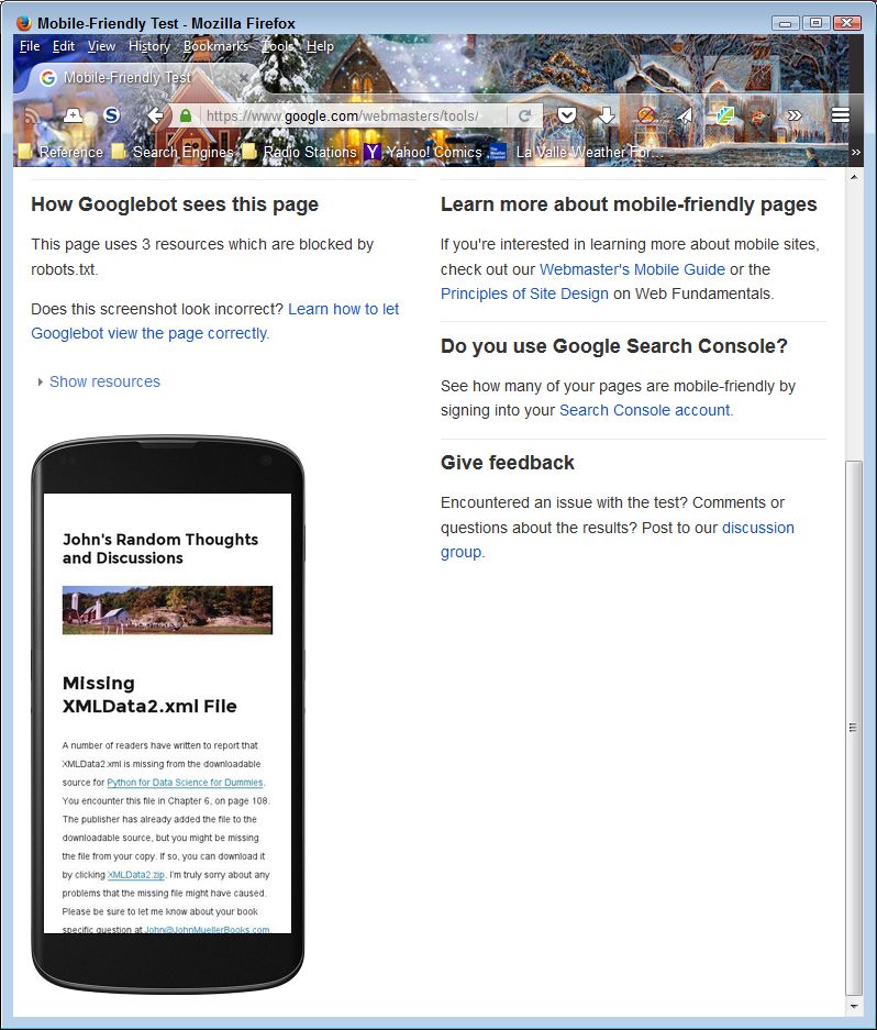
The page contains more than just a validation of the mobile friendliness of your site. When you scroll down, you see a simulated output of your site when viewed on a smartphone. The view is important because it helps you understand how a mobile user will see your site, versus the view that you provide to desktop and tablet users. It’s important not to assume that mobile users have the same functionality as other users do. Here’s the simulated view for my site.

Mobile users may see something different than you expect, even when your site is mobile friendly.
Verify the Smartphone View of Your Site

As more and more people rely on mobile devices to access the Internet, you need to become more aware of what they’re seeing and whether they can use your site at all. According to most authorities, more users access the Internet using mobile devices today, than other devices, such as laptops, desktops, or tables. If you don’t support mobile devices correctly, you lose out on the potential audience for your site. By making the switch to mobile devices and apps, in particular, you have the ability to not only widen your audience, but you also have a better chance of being able to increase your revenue too. Most successful businesses have made the transition to mobile as they don’t want to lose any customers (but the quality of presentation varies greatly and is sometimes useless), as it may mean that they make less money than they could otherwise could from sales and that the influence of their site is far less. Let me know your thoughts about mobile device access at [email protected].

Considering the Authentication of Credit Cards in Web Settings

This is an update of a post that originally appeared on November 27, 2015.

I often write a blog post with the hope that things will change for the better at some point because there are often strategies for making things better if someone will simply implement them. I don’t know about you, but I’m buying more and more items online, which means using my credit card more often than before. That’s why articles like, How Serious a Crime Is Credit Card Theft and Fraud?, attract my attention.

One of the biggest problems is the use of static technology. For example, the Credit Verification Value (CVV), a three or four digit addition to a credit card number, is supposed to help safeguard the credit card. It doesn’t appear as part of the card data accessible through the magnetic strip or the chip. The CVV is actually printed on the card as a separate verification for venues such as web applications. The only problem is that this number is static-it remains the same for however long you own the card. Therefore, once a hacker discovers the CVV, it no longer provides any sort of security to the card owner. Interestingly enough, some sites online will sell you both credit card numbers and their associated CVV. The hackers win again.

A solution to this problem is to change the CVV periodically. Unfortunately, trying to change a printed CVV is impossible without replacing the card. One possible way to overcome this problem involves the addition of an e-paper space on the back of the card that would allow the credit card companies to change the CVV, yet keep it out of the magnetic stripe or chip. A lot of devices currently use e-paper, such as Amazon’s Kindle. The technology provides a matte paper-like appearance that reflects light similar to the way in which paper reflects it, rather than emitting light like an LED does. The difference is that e-paper is often easier to read. There is at least one company offering such a solution today as described at Gemalto Dynamic Code Card – for a more serene online shopping experience.

Oberthur (now Idemia), the inventor of the Motion Code technology used to create the updated CVV, isn’t saying too much about how the technology works. There must be an active connection between the card and a server somewhere in order to update the CVV once an hour as specified in the various articles on the topic. The only problem is in understanding how the update takes place. If the technology relies on something like a Wi-Fi or cell connection, it won’t work in rural areas where these connections aren’t available. Even so, the technology does promise to reduce the amount of fraud that currently occurs-at least, until hackers find a way to thwart it.

What is your feeling about credit card data protection? Are you a business entrusted with protecting your customers’ information? If so, maybe you should find out more here about the consulting available in this particular field of business management to ensure that you’re following the law to the letter. Does Motion Code technology actually provide a promising solution or is it another dead end? How do you deal with potential fraud when creating your applications? Send your ideas to me at [email protected].

Considering Perception in User Interface Design

This is an update of a post that originally appeared on January 24, 2014.

The original version of this article had humans seeing images in as little as 13 ms. Nothing much has really changed since then. I read a few articles recently that reminded me of a user interface design discussion I once had with a friend of mine. First, let’s discuss the articles:

  • The first, Everything we see is a mash-up of the brain’s last 15 seconds of visual information, says that humans can actually see something in as little as 15 ms. That short time frame provides the information the brain needs to target a point of visual focus.
  • The older second article, ‘Sixth Sense’ Can Be Explained by Science, explains how the sixth sense that many people relate as being supernatural in origin is actually explainable through scientific means. The brain detects a change-probably as a result of that 15 ms view-and informs the rest of the mind about it. However, the change hasn’t been targeted for closer inspection, so the viewer can’t articulate the change.
  • The third article, The silent “sixth” sense, is a more scientific and slightly modernized view of the second article. In short, you know the change is there, but you can’t say what has actually changed.

So, you might wonder what this has to do with website design. It turns out that you can use these facts to help focus user attention on specific locations on your site. Now, I’m not talking here about the use of subliminal perception, which is clearly illegal in many locations. Rather, it’s possible to do as a friend suggested in designing a site and change a small, but noticeable, element each time a page is reloaded. Of course, you need not reload the entire page. Technologies such as Asynchronous JavaScript And XML (AJAX) make it possible to reload just a single element as needed. (Of course, changing a single element in a desktop application is incredibly easy because nothing special is needed to do it.) The point of making this change is to cause the viewer to look harder at the element you most want them to focus on. It’s just another method for ensuring that the right area of a page or other user interface element gets viewed.

However, the articles also make for interesting thoughts about the whole issue of user interface design. Presentation is an important part of design. Your application must use good design principles to attract attention. However, these articles also present the idea of time as a factor in designing the user interface. For example, the order in which application elements load is important because the brain can perceive the difference. You might not consciously register that element A loaded some number of milliseconds sooner than element B, but subconsciously, element A attracts more attention because it registered first and your brain targeted it first. This essentially explains the difference between UX and UI, since the two are eternally intermingled in the world of development.

As science continues to probe the depths of perception, it helps developers come up with more effective ways in which to present information in a way that enhances the user experience and the benefit of any given application to the user. However, in order to make any user interface change effective, you must apply it consistently across the entire application and ensure that the technique isn’t used to an extreme. Choosing just one element per display (whether a page, window, or dialog box) to change is important. Otherwise, the effectiveness of the technique is diluted and the user might not notice it at all.

What is your take on the use of perception as a means of controlling the user interface? Do you feel that subtle techniques like the ones described in this post are helpful? Let me know your thoughts at [email protected].

Web Page Units of Measure

This is an update of a post that originally appeared on October 23, 2013.

There are ways today of avoiding any thought of what units of measure the Web page you’re working on uses. For example, I use products like WordPress all the time now to make the task of creating content quickly a lot easier. I don’t ever think about the units of measure I’m using when working with these products. However, when designing an interface for an Android or C# application (as examples), I sometimes do need to think about units of measure because I’m more intimately involved in the user interface design process. Today, applications need to work everywhere on a large number of devices, all of which have different characteristics, so units of measure can become an issue. So, it’s entirely possible that you could create a nearly unlimited amount of content for a website without ever worrying about units of measure, but this blog post is for those times when it does matter.

Some units of measure work better than others do in obtaining a specific result. For example, when you specify placement in pixels (px), you tell the browser to define element placement with regard to the physical units of a display. This is the most precise, yet least flexible, method of defining units of measure. In addition, it can create issues with mobile devices because these devices typically don’t offer that many pixels of display area and may not allow scrolling of information that doesn’t appear in a single screen (the part that appears to the right and toward the bottom of the page).

More flexible units of device-specific measure include the inch (in), centimeter (cm), and millimeter (mm). In this case, the browser converts the measurement to pixels using the device’s conversion metric. For example, a typical PC display uses 96 pixels-per-inch. However, the user can change the metric so that an inch could consume 120 pixels instead (making the elements larger than normal). Whether this flexibility solves the problem of working with mobile devices depends on the mobile device and the metric it uses to convert physical units to pixels.

Besides device and physical measures, you can also use printer’s measures that include the point (pt) and pica (pc). These units of measure theoretically work the same as physical measures because a point is 1/72nd inch and a pica is 12 points (or 1/6th inch). In reality, it’s possible that a browser will convert the units of measure based on the size of the fonts that the device uses. However, you can’t count on this flexibility and must assume that these printer’s measures are simply a different kind of physical measure.

Fortunately there are two units of measure that are guaranteed to reflect the size of a font on the display. The em is a measure of the actual font size. One device may use a 12 point font while another device uses a 10 point font. An em will equal 12 points on the first device and 10 points on the second device without any modification of the code on your part. This feature makes the page quite flexible and usable with any device. The other unit of measure is the ex, which is the measure of the x-height of a font (the median of all of the characters in a particular letter set). As with the em, the ex automatically scales to consider the point size of characters used by a particular device.

All of the units of measure so far are absolute. You place elements on a screen in a precise position. Modern Web design dictates that pages employ Responsive Web Design (RWD) to ensure that the page will work on any device. A part of RWD is to use relative placement wherever possible so that the page and its elements automatically resize to meet the needs of a device. You use the percentage (%) unit of measure in this case, where an element uses a percentage of the available space, whatever that space might be. Of course, this approach means that all devices see the entire page. However, a disadvantage of this approach is that the elements might be so small on some devices as to make them unusable.

The article, CSS values and units, provides you with more information about units of measure as they apply to Cascading Style Sheets (CSS). These guidelines generally apply to other working environments as well. What are your thoughts about units of measure? Which do you use most often? Let me know at [email protected].

Using TinyURL in Books

At one point in my career I avoided the use of URL shortening sources because readers complained that they couldn’t be sure where the URL would take them. For example, a TinyURL URL has the tinyurl.com host in it. The TinyURL for my blog is https://tinyurl.com/2p9xw5u7. The article, Secure Options for URL Shortening, discusses the whole matter of URL shortening security in more detail, but at least some organizations still don’t trust the process.

The problem I’m encountering as both a writer and a reader is that URLs, especially technical URLs, are getting progressively longer. I’m reading one book right now where some URLs are spreading over multiple lines in the text and typing them by hand is a nightmare. Some of my readers are starting to complain to me as well. They don’t want to type a URL that extends over multiple lines in the book, so they’re not looking at that really cool resource I found that explains some technical detail in a manner that I can’t really include in the book due to space limitations.

The way around the URL shortening problem is to use a site like TinyURL that has a trick you can apply to verify where a URL goes. In this case, you simply add the word preview to the URL like this: https://preview.tinyurl.com/2p9xw5u7. Now you can see where the URL goes before you go there, making the use of TinyURL significantly safer.

What I need to know before I start adopting TinyURL in my books for all URLs is whether this would produce major discontent among my readers or you would welcome the change with relief. Personally, I think the use of TinyURL will spare everyone a lot of frustration. However, I need to know what you think. Please write with your thoughts and concerns to [email protected].

In Praise of Dual Monitors

This is an update of a post that originally appeared on February 5, 2014.

In reading many of my old blog posts, I’m finding that many of the things I said way back when apply equally well today. I’ve received email from budding developers who use their smartphone to code. Just how they perform this trick is beyond me because I squint at the screen performing the simplest of tasks and often find that my fingers are two sizes too big. I have tried coding on a tablet, a laptop, and (oddly enough) my television. While they do work, they’re not particularly efficient, so I’ll stick with my dual-monitor desktop system for coding.

Yes, I know that some developers use more than just two monitors, but I find that two monitors work just fine. The first monitor is my work monitor—the monitor I use for actually typing code. The second monitor is my view monitor. When I run the application, the output appears on the second monitor so that I can see the result of changes I’ve made. Using two monitors lets me easily correlate the change in code to the changes in application design. Otherwise, I’d be wasting time switching between the application output and my IDE.

I also use two monitors when writing my books. The work monitor contains my word processor, while my view monitor contains the application I’m writing about. This is possibly one time when a third monitor could be helpful—one to hold the word processor, one to hold the IDE, and one to view the application output. However, in this case, a third monitor could actually slow things down because the time spent viewing the output of an example is small when compared to creating a production application.

The concept of separating work from the source of information used to perform the work isn’t new. People have used the idea for thousands of years, in fact. For example, when people employed typewriters to output printed text, the typist employed a special stand to hold the manuscript being typed. The idea of having a view of your work and then another surface to actually work on is used quite often throughout history because it’s a convenient way to perform tasks quickly. By employing dual monitors, I commonly get between a 15 percent to 33 percent increase in output, simply because I can see my work and its associated view at the same time.

Working with dual monitors not only saves time, but can also reduce errors. By typing as I view the output of applications, I can more reliably relate the text of labels and other information the application provides. The same holds true when viewing information sources found in other locations. Seeing the information as I type it is always less likely to produce errors.

Don’t get the idea that I support using dual monitors in every situation. Many consumer-oriented computer uses are served just fine with a single monitor. For example, there isn’t a good reason to use two monitors when viewing e-mail in many cases—at least, not at the consumer level (you could make a case for using dual monitors when working with e-mails and a calendar to manage tasks, for example). Dual monitors commonly see use in the business environment because people aren’t necessarily creating their own information source—the information comes from a variety of sources that the user must view in order to use reliably.

Do you see yourself using dual monitors? If you use such a setup now, how do you employ it? Let me know at [email protected].

Choosing Variable Names

This is an update of a post that originally appeared on January 17, 2014.

It often surprises me that developers seem to choose completely useless variable names like MyVariable when creating an application. Although MyVariable could be an interesting variable name for an example in a book, it never has a place in any sort of production code. Even then, I try to create book examples with meaningful variable names, especially when getting past the initial “Hello World” example. Variable names are important because they tell others:

  • What sort of information the variable stores
  • When the variable is commonly used
  • Where the variable is used
  • How to use the variable correctly
  • Why the variable is important

In some cases, the variable name could even indicate who created the variable; although, this sort of information is extremely rare. If you never thought a variable name should contain all that information, then perhaps you haven’t been choosing the best variable names for your application.

Even with these restrictions in place, choosing a variable name can be uncommonly hard if you want to maximize the name’s value to both yourself and other developers. Some organizations make the selection process easier by following certain conventions. If you don’t have an organizational style guide for variable naming, modern programming languages like Python commonly provide a style guide for you to use. These style guides often consider a great deal more than simply variable naming and include issues like the amount of indentation to use. In some respects, they become quite draconian in their approach. Other style guides, like the one for C#, are less time consuming to learn, which is a good thing because most developers have better things to do with their time than to learn some of these nitpicky details. A few languages suffer from an abundance of style guides, like C++. It’s best to choose one of them, such as the Google C++ Style Guide, and stick with it.

However, let’s say that you want to create your own style guide for your organization to use because you use multiple languages and having a different style guide for each language seems just a bit absurd, not to mention adding needless complexity. In this case, you need to ask yourself a series of questions to determine how you want the style guide to work, such as these:

  1. What sort of casing do you want to use for what types of variables?
  2. What information does the variable contain (such as a list of names)?
  3. How is the variable used (such as locally or globally, or to contain coordinates, or a special kind of object)?
  4. When appropriate, what kind of information does the variable contain (such as a string or the coordinate of a pixel on screen)?
  5. Is the variable used for a special task (such as data conversion)?
  6. What case should prefixes, suffixes, and other naming elements appear in when a language is case sensitive?

The point is that you need to choose variable names with care so that you know what they mean later. Carefully chosen variable names make it possible for you to read your code with greater ease and locate bugs a lot faster. They also make it easier for others to understand your code and for you to remember what the code does months after you’ve written it. However, most important of all, useful variable names help you see immediately that a variable is being using the wrong way, such as assigning the length of a name string to a coordinate position on screen (even though both variables are integer values). Let me know your thoughts about variable naming at [email protected].