
This is an update of a post that originally appeared on January 6, 2016.
Is your application mobile friendly? It seems simple enough, but the answer can be very tough to come by. This whole concept of mobile device friendliness sometimes seem like an enigma wrapped in a Zen riddle. There is actually a difference between sites that are mobile friendly and those that are mobile responsive, in that a mobile responsive design does a lot more for the mobile users (and is always mobile friendly by default).
Most development tools today make a strong attempt at helping you create mobile friendly applications. In addition, new technologies and tools are helping developers create useful applications. Fortunately, vendors such as Google are now making it possible for you to verify that your site is mobile friendly with an easy to use check. All you need to do is point your browser to https://www.google.com/webmasters/tools/mobile-friendly/, enter an URL, and click Analyze. You get a quick answer to your question as shown here within a few seconds.
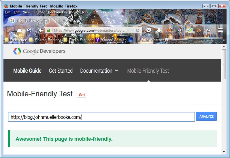
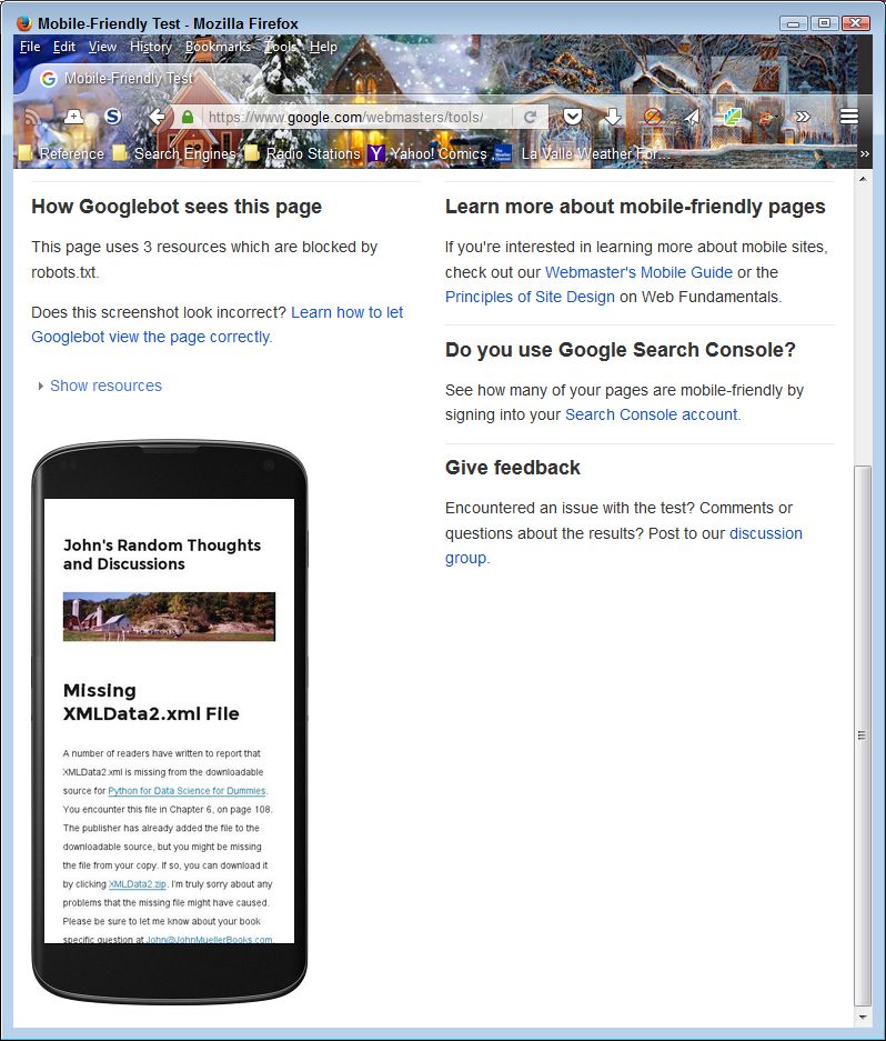
The page contains more than just a validation of the mobile friendliness of your site. When you scroll down, you see a simulated output of your site when viewed on a smartphone. The view is important because it helps you understand how a mobile user will see your site, versus the view that you provide to desktop and tablet users. It’s important not to assume that mobile users have the same functionality as other users do. Here’s the simulated view for my site.
As more and more people rely on mobile devices to access the Internet, you need to become more aware of what they’re seeing and whether they can use your site at all. According to most authorities, more users access the Internet using mobile devices today, than other devices, such as laptops, desktops, or tables. If you don’t support mobile devices correctly, you lose out on the potential audience for your site. By making the switch to mobile devices and apps, in particular, you have the ability to not only widen your audience, but you also have a better chance of being able to increase your revenue too. Most successful businesses have made the transition to mobile as they don’t want to lose any customers (but the quality of presentation varies greatly and is sometimes useless), as it may mean that they make less money than they could otherwise could from sales and that the influence of their site is far less. Let me know your thoughts about mobile device access at [email protected].