Checking for Mobile Friendliness

This is an update of a post that originally appeared on January 6, 2016.

Is your application mobile friendly? It seems simple enough, but the answer can be very tough to come by. This whole concept of mobile device friendliness sometimes seem like an enigma wrapped in a Zen riddle. There is actually a difference between sites that are mobile friendly and those that are mobile responsive, in that a mobile responsive design does a lot more for the mobile users (and is always mobile friendly by default).

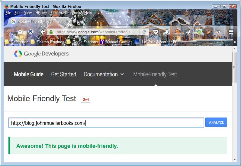
Most development tools today make a strong attempt at helping you create mobile friendly applications. In addition, new technologies and tools are helping developers create useful applications. Fortunately, vendors such as Google are now making it possible for you to verify that your site is mobile friendly with an easy to use check. All you need to do is point your browser to https://www.google.com/webmasters/tools/mobile-friendly/, enter an URL, and click Analyze. You get a quick answer to your question as shown here within a few seconds.

Verify that your site will support mobile users by performing a mobile friendly check.
Output from a Successful Mobile Friendly Check

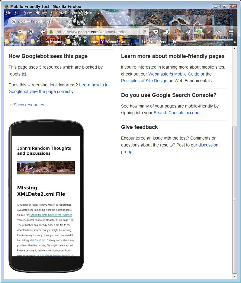
The page contains more than just a validation of the mobile friendliness of your site. When you scroll down, you see a simulated output of your site when viewed on a smartphone. The view is important because it helps you understand how a mobile user will see your site, versus the view that you provide to desktop and tablet users. It’s important not to assume that mobile users have the same functionality as other users do. Here’s the simulated view for my site.

Mobile users may see something different than you expect, even when your site is mobile friendly.
Verify the Smartphone View of Your Site

As more and more people rely on mobile devices to access the Internet, you need to become more aware of what they’re seeing and whether they can use your site at all. According to most authorities, more users access the Internet using mobile devices today, than other devices, such as laptops, desktops, or tables. If you don’t support mobile devices correctly, you lose out on the potential audience for your site. By making the switch to mobile devices and apps, in particular, you have the ability to not only widen your audience, but you also have a better chance of being able to increase your revenue too. Most successful businesses have made the transition to mobile as they don’t want to lose any customers (but the quality of presentation varies greatly and is sometimes useless), as it may mean that they make less money than they could otherwise could from sales and that the influence of their site is far less. Let me know your thoughts about mobile device access at [email protected].

Web Page Units of Measure

This is an update of a post that originally appeared on October 23, 2013.

There are ways today of avoiding any thought of what units of measure the Web page you’re working on uses. For example, I use products like WordPress all the time now to make the task of creating content quickly a lot easier. I don’t ever think about the units of measure I’m using when working with these products. However, when designing an interface for an Android or C# application (as examples), I sometimes do need to think about units of measure because I’m more intimately involved in the user interface design process. Today, applications need to work everywhere on a large number of devices, all of which have different characteristics, so units of measure can become an issue. So, it’s entirely possible that you could create a nearly unlimited amount of content for a website without ever worrying about units of measure, but this blog post is for those times when it does matter.

Some units of measure work better than others do in obtaining a specific result. For example, when you specify placement in pixels (px), you tell the browser to define element placement with regard to the physical units of a display. This is the most precise, yet least flexible, method of defining units of measure. In addition, it can create issues with mobile devices because these devices typically don’t offer that many pixels of display area and may not allow scrolling of information that doesn’t appear in a single screen (the part that appears to the right and toward the bottom of the page).

More flexible units of device-specific measure include the inch (in), centimeter (cm), and millimeter (mm). In this case, the browser converts the measurement to pixels using the device’s conversion metric. For example, a typical PC display uses 96 pixels-per-inch. However, the user can change the metric so that an inch could consume 120 pixels instead (making the elements larger than normal). Whether this flexibility solves the problem of working with mobile devices depends on the mobile device and the metric it uses to convert physical units to pixels.

Besides device and physical measures, you can also use printer’s measures that include the point (pt) and pica (pc). These units of measure theoretically work the same as physical measures because a point is 1/72nd inch and a pica is 12 points (or 1/6th inch). In reality, it’s possible that a browser will convert the units of measure based on the size of the fonts that the device uses. However, you can’t count on this flexibility and must assume that these printer’s measures are simply a different kind of physical measure.

Fortunately there are two units of measure that are guaranteed to reflect the size of a font on the display. The em is a measure of the actual font size. One device may use a 12 point font while another device uses a 10 point font. An em will equal 12 points on the first device and 10 points on the second device without any modification of the code on your part. This feature makes the page quite flexible and usable with any device. The other unit of measure is the ex, which is the measure of the x-height of a font (the median of all of the characters in a particular letter set). As with the em, the ex automatically scales to consider the point size of characters used by a particular device.

All of the units of measure so far are absolute. You place elements on a screen in a precise position. Modern Web design dictates that pages employ Responsive Web Design (RWD) to ensure that the page will work on any device. A part of RWD is to use relative placement wherever possible so that the page and its elements automatically resize to meet the needs of a device. You use the percentage (%) unit of measure in this case, where an element uses a percentage of the available space, whatever that space might be. Of course, this approach means that all devices see the entire page. However, a disadvantage of this approach is that the elements might be so small on some devices as to make them unusable.

The article, CSS values and units, provides you with more information about units of measure as they apply to Cascading Style Sheets (CSS). These guidelines generally apply to other working environments as well. What are your thoughts about units of measure? Which do you use most often? Let me know at [email protected].

New Look! New Features!

If you’re visiting my blog for the first time this year, you probably noticed a few changes in its appearance. Sometimes a site changes its appearance simply to provide a different look—to enhance its aesthetic appeal. It’s true that I had used the previous design for a number of years, but that’s not the reason for the changes you see today. These changes come as the result of input from the people who read my blog and took the time to comment on it.

The biggest change is one that you can’t readily see until you access my blog from a smartphone. My site now works well with devices of all sizes so that you can gain access to the information my blog provides from any location using any device. It took me a while to find a theme that I thought would preserve most of the look and feel of the original blog, but allow for this added functionality. Even though the feel is a little different, the addition of this feature is important to enough readers that I really want it to work well.

As part of making my blog easier to use, I also went for a cleaner look. The new format should work in a wider range of settings, even in bright sunlight (as well as anything works in bright sunlight). The larger type should also make it easier for people with special visual needs to see. I tested the new setup out on a number of monitors and find that it scales better than the old design too.

Part of the update also affects my web site. I wanted to provide better consistency between the two locations. Some viewers said it was a bit disconcerting to use one layout on the web site and another on the blog. My original intent had been to provide the best layout for each setting, but this method of configuring the two locations didn’t work nearly as well as I thought it would.

Of course, I always want your input because this site is specifically designed to meet your needs. I want the readers of my books to get maximum benefit from them, which means having a blog that actually meets those needs. If you see what you like or want to express concerns about issues you don’t like, please feel free to contact me at [email protected]. As always, your input is essential to the success of my books, my blog, and my other endeavors!

During the upcoming months I do plan to make additional changes. The blog has gotten a bit unwieldy, so I plan to remove some existing content to make room for new information. I’ll also be adding more linkage between my web site and the blog so that the two work better together. Your patience during this time of transition is greatly appreciated!


Review of HTML5 Step by Step

Microsoft has thrown developers yet another curve—Windows 8 will rely on HTML5 and JavaScript for a programming interface. The revelation has many developers horrified. For me, it means updating my HTML and JavaScript skills, which was one motivation for reading the book reviewed in today’s post. HTML5 Step by Step, written by Faithe Wempen, provides a quick method of getting up to speed on HTML5.

This book is designed to aid anyone who wants to know how to work with HTML5, which means that it starts out extremely simple. The book avoids the ever popular Hello World example, but the example it does provide is small and easily understood. The chapters don’t remain simple, however, so even if you have some experience with HTML, you can use this book to update your skills. You’ll likely want to start around Chapter 3 if you are experienced and skim through the material until you come to something unfamiliar, which could happen relatively fast given the changes in HTML5.

HTML5 Step by Step is light on theory and reference information, but heavy with hands on experiences. It relies on using Notepad as an editor, which may seem like an odd choice, until you read the “Why Learn HTML in Notepad?” section of the Introduction. The author’s reasoning is akin to the same reasoning I would use, which is to make sure that the reader types everything and understands why a particular element is required. If you really want to get the most out of this book, you have to do the exercises in Notepad as the author suggests. Otherwise, I guarantee you’ll miss out on something important. Faithe has made a great choice of teaching aids in this case.

Chapter 1 is most definitely designed for the rank novice. It even shows how to set up the examples directory as a favorite in Notepad. However, unlike many books, the rank novice should read the book’s Introduction because Faithe does provide some needed information there, such as the “Understanding HTML Tags” section.

Chapter 2 gets the reader started with some structural elements. Faithe covers everything that the reader is likely to need for a typical starter Web page. I wish that the chapter had covered <meta> tags in a little more detail, or at least provided a table listing them, but this book does have an emphasis on hands on exercises, so the omission isn’t a glaring one. As an alternative to including the information, an update could provide a URL that lists the tags so the reader knows where to go for additional information.

By Chapter 3, the reader is formatting text and starting to make the sample site look pretty. I really thought Faithe did a nice job of moving the reader along at a fast, but manageable pace. She shows the reader how to make effective use of tag combinations, such as the <kbd> (keyboard) and <b> (bold) tags.

There is the smallest amount of reference information in some chapters. For example, Chapter 4 contains a table on page 50 showing the list attributes. These references are very small and quite helpful, but the reader should understand that the emphasis is on doing something and that the reference material may not be complete. For example, the special symbols table on page 56 is missing the em dash, which is something most people use.

The book progresses at a reasonable pace. Never did I find myself rushed. The examples all seem to work fine and I didn’t find missing steps in the procedures. The author uses an adequate number of graphics so that the reader doesn’t get lost. I liked the fact that every exercise ends with a cleanup section and a list of the major points that the reader should have gotten from the exercise.

Readers who are only interested in new tags will need to wait until Chapter 9 to see one. The <figure> tag makes an appearance on page 141. However, even some professionals didn’t use all of the HTML4 tags and it really does pay to start at Chapter 3 and look for something you don’t recognize. It may surprise you to find that an earlier chapter contains a somewhat new (but not new to HTML5 tag) that you’ve passed by.

There are a few nits to pick with this book. The first is that the author places the accessibility information in an appendix where almost no one is going to read it. The information should have appeared as part of the rest of the book as appropriate. In addition, the author misses the big point that most people today have some sort of special need addressed by accessibility aids. The number of people who are colorblind alone is 8 percent of the male population and 0.5 percent of the female population. This book is unlikely to help you create a truly accessible sitenot that this is the reason you’re buying the book.

The second is that Appendix C doesn’t really help very much with the additions and subtractions for HTML5. For example, Appendix C doesn’t tell you about the new <aside> tag. If you want a quick list of the new tags, check out the www.w3schools.com HTML5 New Elements page. (I checked the missing <aside> tag against a number of other sites, such as About.com.) The point is that Appendix C won’t give you the complete picture. Again, this isn’t one of the selling points of the book, but the list should have been complete.

The third is that there isn’t really enough information about why something is done or why it changedsimply that it must be done or that it did change. The reader probably doesn’t want a full blown history of the change, but the why of something can make understanding and, more importantly, remembering a concept easier. Still, this particular nit is minor since the purpose of the book is to get you started with HTML5 quickly and not to explore it at a theoretical level.

Overall, HTML5 Step by Step is a great book for the novice who wants to learn how to create Web pages. It’s also an acceptable book for someone who’s experienced with HTML coding, but wants to get up-to-date on the HTML5 changes quickly. This book is definitely designed for someone who wants to do something, rather than simply read about it. If you don’t perform the exercises, you won’t get much out of the book.
 

Using a Horizontal Web Site Layout

A friend recently wrote to me regarding an issue with Web site layout. Of course, I’ve dealt with Web design issues in a number of my booksmost notably C# Design and Development and Accessibility for Everybody: Understanding the Section 508 Accessibility Requirements. If you look at most Web sites today, they all have three serious problems:

  • The line length is too longforcing the eye to work extra hard to read the material because the eye loses track of the line and actually making it tiresome to review the material.
  • The page contains too much material, which makes it tiresome for anyone working with a screen reader to listen to all the material before finding the one bit of information actually required from the site.
  • The use of vertical scrolling is contrary to the historical use of horizontal scrolling. If you look at how people worked with scrolling in ages past, it was always horizontal, making it easier to read the material.

She even sent me two articles that describe the problem in greater detail. The first article is entitled, “Are Horizontal Website Layouts the Wave of the Future?” and points out that research shows that most people don’t even read the excess material on a Web site. If nothing else, the strong research showing that my efforts are being wasted would tend to make me rethink my design. The second article is entitled, “Horizontalism and Readability” and it places more emphasis on the historical approach to horizontal layout, rather than focus on modern research. I tend to prefer tested approaches to presenting information when I can get them (new ideas are fine for someone else to test).

Of course, a Web site is not the same as printed material. Trying to equate the two could very well be a mistake. Here is my take on how the mediums differ:

  • The method of presentation differs. You’re not relying on paper, you’re using a video screen of some sort and that does make a difference in how the reader perceives the material.
  • The environment differs. I don’t usually sit in my easy chair next to the fire when I read materials online. I’m normally in my office in a formal work environment.
  • The approach to reading differs. My paper reading environment is relaxed and long term. It’s nothing for me to spend an entire day reading a good book. My online reading is more like a sprintI find what I need quickly and never read for more than a half hour at a time.
  • The technology differs. When I read a book, I get print in one size. So, if the print is less than appealing or causes eye fatigue, I’m just stuck with it. My browser allows me to change the font size a Web site uses so I can make the print eye friendly. Although, I would still recommend wearing reading glasses if you find that you’re experiencing eye fatigue from staring at a computer screen, but life should be made easier if you can alter the font size. In fact, I can even use a CSS file to change the typeface and other features for some Web sites.

The obvious question now is whether the two environments differ enough that considerations normally made for paper don’t apply to Web sites. My thought is that creating Web sites with smaller amounts of material, eye friendly design, and shorter columns are all great ideas, but I’m not completely sold on the idea of horizontal scrolling. Of course, every person or business has their preference about how they want their website to look, and that’s fine. That is what makes everyone different. Some may decide to design it themselves, whilst others may decide to enlist the help and expertise of somewhere like Plenty of Pixels – Pasadena Website Design to incorporate everything they want to see on their website. As long as you have all the information you need to attract customers, that’s all that matters. But horizontal scrolling? That’s another story entirely. What is your take on this idea. Let me know at [email protected].