Using Tooltips on a Web Page

This is an update of a post that originally appeared on May 6, 2013.

Some developers focus on functionality, rather the usability, when designing their Web pages. The tradeoff is usually a bad one because users favor usability—they want things simple. One of the issues that I find most annoying on some sites is the lack of tooltips—little balloons that pop up and give you more information about a particular item. Adding tooltips requires little extra time, yet provides several important benefits to the end user:

  • Less experienced users obtain useful information for performing tasks such as filling out a form.
  • More experienced users obtain additional information about a given topic or the endpoint of a link.
  • Special needs users gain additional information required to make their screen readers functional.
  • Developers are reminded precisely why an object is included on the page in the first place.

In short, there are several good reasons to include tooltips. The only reason not to include them is that you feel they take too much time to add. If you find that you want additional information on making your site more accessible so that everyone can use it, check out another one of my books, Accessibility for Everybody: Understanding the Section 508 Accessibility Requirements. This book contains all of the information you’ll ever need to address every accessibility issue for any kind of application you want to create.

Accessibility is becoming more and more of a concern as the world’s population ages. In fact, everyone will eventually need some type of accessibility assistance if they live long enough. If you’re a developer, adding something as simple as tooltips to your pages can make them significantly easier to use. Users should request the addition of accessibility aids when sites lack them (and vote with their pocketbook when site owners refuse to add them). Let me know your thoughts about accessibility in general and tooltips in specific at [email protected].

A Visual Studio Quick Guide to Accessibility (Part 2)

In my previous post, A Visual Studio Quick Guide to Accessibility (Part 1), I discussed one particularly important accessibility feature. The use of keyboard accelerators is essential because many people use them to improve productivity. Making them visible is important because you can’t use a feature you can’t see. This post won’t cover all of the ideas and concepts for Visual Studio developers found in Accessibility for Everybody: Understanding the Section 508 Accessibility Requirements. However, it does provide an overview of the most essential accessibility featuresthose that every application should have.

The first feature is the tooltip. Every application should include a ToolTip control. You can then provide a description of every user-accessible control in the ToolTip property for that control. It’s important to stress user-accessible in this case. For example, you won’t provide a ToolTip property value for a Label in most cases because the Label simply marks a user-accessible control such as a TextBox. When the user hovers the mouse over the control, the application displays a helpful bit of information about that control. Screen readers used by those with visual needs also read each of the tooltips to describe the controls to the user. A few rules for using the ToolTip control are:


  • Keep the ToolTip text short. Imagine trying to listen to long diatribes about control functionality when working with a screen reader.
  • Make the ToolTip text specific. Tell the user precisely what the control is designed to do.
  • Emphasize the user’s interaction. Tell the user how to interact with the control, such as “Type the message you want displayed.” or “Click to display a message on screen.”


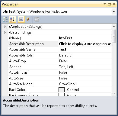
In addition to the ToolTip control, every control has three special accessibility properties as shown here.

Accessibility0201

These properties have specific purposes:


  • AccessibleDescription: A description of how the user should interact with the control. In fact, I normally use the same text as the ToolTip property for this entry and rely on the same rules for creating it.
  • AccessibleName: The name that will be reported to accessibility aids. I normally provide the same text that appears on the control’s caption, minus the ampersand used for the keyboard accelerator.
  • AccessibleRole: The task that the control performs. In most cases, Default works just fine. However, when your control performs an unusual task, you should choose one of the more specific entries so that the accessibility aid can help the user interact with the control.


Make sure you fill out each of the properties so that accessibility aids have the best chance of making your application useful to those who have special needs. In fact, it shouldn’t surprise you to discover that AccessibleRole is already filled out for most controls, so you really only need to fill out two properties in most cases.

The final two changes appear on the form itself. Whenever possible, assign controls to the AcceptButton and CancelButton properties. The AcceptButton provides a means of accepting the content of a dialog box or form by pressing Enter. On the other hand, the CancelButton property makes it possible to reject changes to the form or dialog box by pressing Esc. It’s true that you’ll find situations where you can’t assign a control to one or both properties because there isn’t a default acceptance or cancellation control, but this limitation applies to very few applications.

Accessible applications are significantly easier for everyone to use. Less experienced users can benefit from the inclusion of tooltips. Keyboardists benefit from the presence of keyboard accelerators. Adding these features isn’t difficult or time consuming, so all developers should be adding them.  Let me know your thoughts about accessibility and whether you’d like to see additional accessibility posts at [email protected].