IDE Screenshot Usage in Books

There are cases where it’s very tough to figure out the correct presentation of material in a book, which is made more difficult by some readers preferring one presentation and other readers another. It comes down to how people learn in many cases. Visual learners prefer screenshots, abstract learners prefer text. Of course, there are all sorts of learners between these two extremes. So, what seems like a simple question can become quite complex.

The question at hand is whether to present screenshots of an IDE in a book with the associated example code and its output. The problem is that vendors now assume that developers have very large displays and so have made use of all of that extra screen real estate. In addition, book publishers don’t want books where a single image consumes an entire page. The result is that it’s very hard to get a screenshot where the text is completely readable. It can be done, but the text will generally still be smaller than the print in the book. Older readers complain that they need a magnifying glass to see the text at all.

However, there are benefits to using screenshots. The most important benefit is that, even if the text isn’t completely readable, visual learners can see what their IDE should look like as they follow the progress of procedures in the book. This feedback lets the visual learner know that they are doing things correctly and are getting the correct result. Another benefit is that an example tends to stay in one piece. The graphical output of an example doesn’t end up several pages away from the source code that produces it. Sometimes, textual output is wider than the page will allow using the normal font size. So, the options are to print the output in the book at the normal font size, but in a truncated form, which means that it’s no longer complete. A screenshot can show the complete textual output, but at a smaller font. For beginner readers, the second form, while not optimal, is preferred because truncating the output produces questions in the reader’s mind.

So, how do you feel about IDE screenshots in books? Are they more helpful or more confusing? Part of the reason for posts like this is to get your opinion and discover more about you as a reader. Obviously, a book author wants to use the communication techniques that work best overall for everyone, book space often not allowing for the investigation of every presentation alternative. Let me know your thoughts at [email protected].

Handling Printed Output in a Colorful World

There is an issue that most writers encounter when creating art for a book, but which readers seldom think about. Everything you use on a computer includes color, yet most books (especially technical books) are printed in black and white due to the prohibitive costs of printing them in color. Even many e-books use black and white images because the publisher typesets the document that way. Fortunately, e-book output is changing and you can get color images in them now, but the problem for the author is still there and will be there for quite some time to come.

Translating a colorful world into something that prints well is hard. Most publishers have strict guidelines on configuring a system to produce optimal printed output. Even though the output is optimal, the resulting system display seldom looks like anything you’d use on a regular basis. Even font smoothing is discouraged because it causes problems in the printed output. So, as a starting point, you need to understand that the plain image you see in the book is plain in order to make it easier to print.

Still, even with all of the settings that publishers require and authors invoke, the computer display is still ablaze with colors—some of which won’t print well and some of which will blend into each other. These two problems aren’t apparent at times until the book comes out in print. Putting sky blue next to buttercup yellow works just fine when viewing them in your browser, but they don’t print well. Assuming that the two colors print at all, they’ll be exceptionally light and will tend to blend in a way that makes it impossible to tell one from the other in the book. So, color choice becomes problematic for the author trying to seek a balance between what looks good in the real world and what looks good in a book.

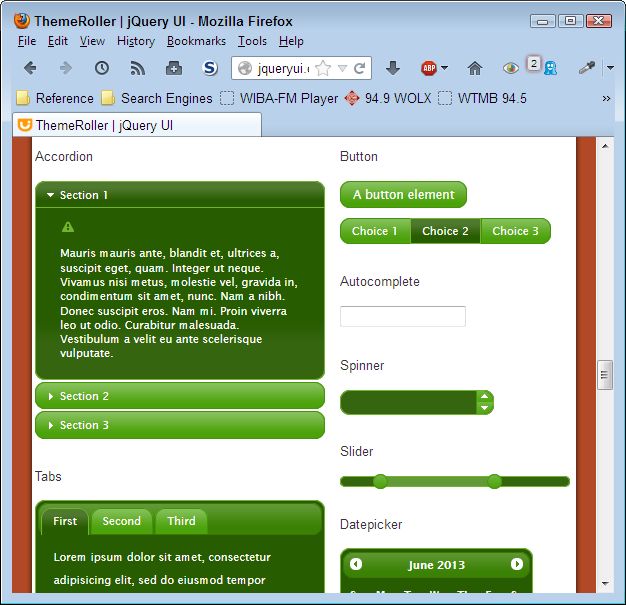
It’s important to remember that books are printed in only two colors: black and white. Gradients of color, grayscale, are simulated by varying the dot density in a particular area of the book so that it appears the colors are either lighter or darker. The best an author can hope to achieve in simulating this environment is to employ a screen capture program that can also create grayscale output. In fact, that’s one of the tasks I perform as part of writing a book. Here’s a color version of one image I added to a recent book.

9781118441428FG1005

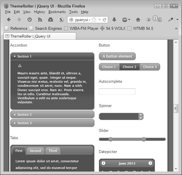
As part of the writing process, I converted the image to grayscale to see how it would appear in the book. Here is the grayscale version:

9781118441428FG1005Grayscale

The grayscale version isn’t nearly as pretty, but it does work. You can see all of the details on the page. Of course, it won’t look precisely like this in the book, but the grayscale version does help me visualize an approximation of the image appearance.

As more publishers begin to use color in their e-books and you begin to employ it to dress up your examples in book, you also need to consider special needs requirements. With this in mind, I also check all of the images in my book with VisCheck, a color blindness simulator, to ensure that readers who have special visual needs can work with the book without problem. Colorblindness (or more precisely, color shifting) causes some people to see colors incorrectly (often blended) even though they appear quite different to someone with normal color vision, so ensuring the colors work for someone with colorblindness is also important to the author.

Every graphic you include in a book is important and readers need to see them well. It may seem like a lot of bother to perform checks like those that I employ, but from the reader’s perspective, the time is well spent. Let me know your thoughts about working with color in books at [email protected].