Accessibility on Windows 8 Metro

Anyone who reads my books knows that accessibility is a major concern for me because I see computers as a means for leveling the playing field for those who have special needs. In fact, my desire to make things as accessible as possible is the reason for writing Accessibility for Everybody: Understanding the Section 508 Accessibility Requirements. Microsoft has always made a strong effort to keep Windows and its attendant applications accessible—at least, to a point. You still need a third party application such as JAWS to make Windows truly accessible (the application developer must also cooperate in this effort as described in my many programming books). Naturally, I’ve been curious about how the Metro interface will affect accessibility.

Here is the problem. The most accessible operating system that Microsoft ever created was DOS. That’s right—the non-graphic, single tasking operating system is a perfect match for those who have special needs precisely because it doesn’t have any bells or whistles to speak of. Screen readers have no problem working with DOS and it’s actually possible to use a considerable number of assistive aids with DOS because it requires nothing more than text support. Of all the the graphical environments that Microsoft has produced, I’ve personally found the combination of Windows XP and Office 2003 to be the most accessible and feature rich. The introduction of the Ribbon with Office 2007 actually reduces accessibility. If you have trouble seeing all of those fancy icons and the odd layout of the Ribbon, you’re not going to enjoy working with the Ribbon.

I installed and tried the developer version of Windows 8 to test it for accessibility. Now, it’s a pre-beta product and there aren’t any Windows 8 products out for applications such as JAWS, so I have to emphasize that I didn’t test under the best of conditions. In fact, you could say that my test was unfair. That said, I did want to see how bad things actually are. Let me say that JAWS works acceptably, but not great, with the classic interface. It doesn’t work at all with the new Metro interface (at least, I couldn’t get it to work). So, unless you’re willing to trust Microsoft completely, you’re out of luck if you have a visual need at the moment. Things will improve, that much is certain, but it’s important to keep a careful eye on how Windows 8 progresses in this area.

The new version of Narrator
does come with some new features. Some of the features may seem like
glitz at first, but they’re really important. For example, the ability
to speed the voice up or slow it down, and the ability to use different
voices, helps with cognition. A more obvious improvement is the ability
to use different commands with Narrator. Narrator will also work with
Web pages now as long as you’re willing to use Internet Explorer as your
browser.

It’s with this in mind that I read the post about Windows 8 accessibility entitled, “Enabling Accessibility.” Let me be up front and say that accessibility is an important issue to Microsoft—at least, it has been in the past. According to this post, 15% of the people using computers worldwide have accessibility needs. The more important piece of information is that the number of people with accessibility needs is going to increase because the population is aging and things such as eyesight deteriorate as we get older.

From what I garnered from the post, developers are going to have to jump through an entirely new set of hoops to make their applications accessible in Windows 8. Some developers already have problems making their applications accessible and some simply don’t care to make their applications accessible. If you fall into the former category, you can read my A Visual Studio Quick Guide to Accessibility (Part 1) and A Visual Studio Quick Guide to Accessibility (Part 2) posts in addition to reading my books. If you fall into the latter category, you’re going to find it harder to support users in the future and will definitely see reduced sales because the number of people with accessibility needs is increasing.

Microsoft is improving the Assistive Technologies (ATs) it provides with Windows in order to meet new accessibility requirements. However, my experience with these ATs is that they help people with minor problems, not someone who has a major issue. Even the author of the blog post acknowledges this deficiency in Microsoft’s support. So, if you really do need to use an eye gaze system to work with Windows, you’re going to have to wait for an update to your software before you can use Windows 8 and that update will be longer in coming due to the Metro interface with all the new hoops it introduces.

Part of the new developer interface revolves around the enhanced experience that a combination of HTML 5 and XAML provide. In addition, Windows 8 will require developers to use the new Web Accessibility Initiative-Accessible Rich Internet Applications (WAI-ARIA) standard. The plus side of the change is that it does adhere to standards that other platforms will use—the minus side is that developers will have to learn yet another programming paradigm. If you want a quick overview of how this will actually work, check out, “Accessible Web 2.0 Applications with WAI-ARIA.” The quick take is that, despite Microsoft’s claims to the contrary, developers will need to do more now than simply fill in a few properties in their applications to make the application accessible. You’ll actually have to code the accessibility information directly into the HTML tags.

The post provided by Microsoft on Windows 8 accessibility support leaves out a few unpleasant details. For example, it gives the impression that your Visual Studio Express 2010 application is accessibility ready right from the start. That’s true to an extent. However, the author leaves out important details such as providing speed keys for users who need them (the requirement does appear in a bullet list; how Windows 8 will help you implement them isn’t). The current templates don’t provide for this need and the Metro interface will make it harder to add them.

One of the most positive changes is that Microsoft is going to test Metro applications for accessibility. If the application meets the baseline (read minimal) requirements, the developer will be able to market it as accessible. At least those with special needs will be able to find software that meets a minimal level of accessibility. However, that minimal level still might not fulfill every Section 508 requirement (something that companies commonly sidestep as being inconvenient). In fact, I’m willing to go out on a limb here and state that minimal is probably not going to be enough to help many of the people with accessibility needs. You’ll be able to support JAWS at a basic level, but more complex software and setups will require additional help from developers.

One of the things you should keep in mind is that Microsoft is proactive to an extent about accessibility. They even provide a special Microsoft Accessibility site to provide updates about their strategy. However, I’ve been finding myself tested with their direction as of late. The interfaces they’re putting together seem less accessible all the time. I’d love to get input from anyone who uses their tools daily to meet specific needs. Talk to me about accessibility requirements, especially those needed to make Metro usable, at [email protected].


Is Privacy a Right?

One of the readers of C# Design and Development took me to task some time ago for not discussion the matter of security in my book. He has been the only reader to ever ask me about the issue of privacy, so I didn’t think too much about it at the time. When I wrote the book, I thought it far more important to discuss security-keeping the data, application, and user safe. In fact, the book makes security part of an application triad the developer must consider during the design process. My thinking at the time was that privacy is a matter settled by management as part of a policy that is often implemented outside the developer’s control. To a certain extent that perception is still valid, but I’ve since learned that the developer does bear some responsibility toward the user when it comes to privacy.

A recent ComputerWorld article has made me think yet again about the whole issue of privacy. In this case, OnStar is collecting absolutely every last bit of information they can about you, without your permission, and selling it to anyone with a few pennies to spend. (A later article says that OnStar is reversing course on this decision.) They do tell you about spying on you, but you’ll only find this information if you read through the legalese contained in the Terms & Conditions. However, there are some people who don’t think you have any right to privacy in the first place. Industry leaders that include Facebook chief Executive, Mark Zuckerberg, Google chief, Eric Schmidt, Sun Microsystems chief, Scott McNealy, and Oracle chief, Larry Ellison would prefer you not to have any privacy whatsoever. They’d simply love to dig into every aspect of your life. The use of newer technologies, such as super cookies, have also proven that companies have a strong desire to invade your privacy.

The design of supercookies and the obvious desire of some technology leaders to invade your online privacy and collect data on you has subsequently inspired many to find ways to hide their IP address. A lot of the time, we are so caught up in luxurious technology, such as iPhones or Macbooks, that we don’t even realize that these devices are collecting data on us and feeding it to all sorts of websites. It’s no surprise that people are now opting to look into VPN’s and proxies to not only hide their IP and therefore protect their personal data, but to unblock websites on Mac and other devices.

So, the developer is faced with a number of questions when it comes to privacy. The most important of which is whether privacy is a right. According to the ComputerWorld article, the senate has finally woken up and decided that perhaps privacy is a matter they really should consider, especially when it comes to such brazen violations such as the one by OnStar. There is some validity to the belief that the Constitution and Bill of Rights offers at least some protection of privacy. Some laws, such as the Health Insurance Portability and Accountability Act (HIPAA) add additional rights. However, I imagine that we’ll experience years of delays, political wrangling, and legal interpretation before those rights are specifically spelled out in a way that developers (and others) can understand.

Assuming that a certain level of privacy is a right and that it’s legally protected, the developer still has a host of questions to answer. Here are some of the things you should think about as a developer when designing an application.

  • What is the company policy regarding privacy?
  • How does an application specifically guard or expose a user’s privacy?
  • When does a user’s right to privacy override the desire of management to invade it?
  • Which rights does a user forfeit as a member of an organization?
  • Is privacy configurable as an opt in or an opt out selection?
  • Precisely what information does the company collect?
  • Precisely what information does the company actually need to conduct business?


If the developer of the OnStar system had included a simple switch for turning the device off (disallowing any eavesdropping of any sort), the whole issue discussed in the ComputerWorld article would be moot. Unfortunately, no one thought to include such a switch, despite the fact that it would have been an obvious design addition. Of course, we don’t need to look specifically at OnStar as a bad example of privacy thwarted. Many applications today include a “call home” feature and won’t even work if you don’t have an Internet connection. In short, someone somewhere is spying on you constantly.

When you look for privacy-related design information for the developer online or in books, you find it mysteriously missing. The reader who called my book into question was right to do so. I hope that this small article has at least started you thinking about privacy and overcomes the omission in my book. Future posts will fill in some additional gaps, but I’d like to hear your perspective on the issue of privacy first. What questions do you have about privacy? How would you design an application that protects user privacy while meeting organizational needs for information? Let me know at [email protected].


Is the Virtual Office Doable?

I’ve been talking with a long time friend and an ardent reader about the future of the physical officethe place where people go to work with computers managed by an organization using an IT staff and connected to a centralized server setupthe sort of place that nearly everyone works at today. The physical office costs tons of money to run, is incredibly inefficient, uses a lot of resources, and has a huge carbon footprint. After talking about this topic for a while, I’m becoming convinced that the physical office served a purpose at one time, but now it has become the domain of the control freak boss who has to know precisely what everyone is doing at precisely every minute. (There are no economic or technical reasons to maintain the physical office that I’ve been able to come up with.) Given all of the events that are going on in the world today, I think the virtual officean office where you report to work by logging into your computer at homewill eventually become the norm.

There are many scenarios where a virtual office won’t work and this post doesn’t include them. For example, I can’t imagine a virtual hospital working with today’s technologyyou’ll still need to visit the doctor in his office. Services which require personal contact will still require some sort of centralized facility for the time being. However, even with government offices, it’s becoming quite possible to do everything needed online without actually visiting a physical office, so the virtual office is possible even in this environment. All they’d need is a reliable web host to make sure the office is never offline when needed – someone like hostiserver.com perhaps – and it’d be solid.


Physical offices require infrastructure that is duplicated by the home. You have the physical building, the resources required for human needs, and so on. In short, you’re using two buildings to meet requirements that could be addressed by one. Because physical offices are built to meet industrial requirements, they also cost more to build and maintain than the home. In short, physical offices are a money pit that drag down the bottom line of any company using them.

Now, consider for a moment that everyone has to drive to a physical office. They face energy zapping traffic for some amount of time each day. According to an ABC report, Americans spend 100 minutes on average behind the wheel commuting to work. That’s 100 minutes that the employee could be working instead of driving. At least half of this commuting time comes off the top of the employee’s energy reserve, so organizations are wasting an employee’s best energy on traffic. In addition, in order to accommodate the formal office environment, the employee must conform to the business’ schedule, rather than working when it’s easiest to work, making it quite likely that the business isn’t even receiving the employee’s best effort when they’re on the job. The virtual office promotes efficiency by making it possible for an employee to perform work when energy reserves are the highest and it’s possible to devote dedicated time to the needs of the business. Sick days are also less common because the employee can work at least part of a day in most cases.

Resource usage is higher per person in a physical office than at a home for a number of reasonsthe most important of which is the perception is that someone else is paying for all of the waste that occurs in this environment. For example, all the lights are left on all of the time in most cases. In a virtual office environment, where each employee is responsible for paying the cost of things like electricity, you can be certain that less is wasted. In addition, consider the waste of unnecessary print jobs (or the need to print anything at all in this digital age). There is also all of the duplication that occurs between home and officeplacing the office in the home negates this duplication.

Global warming has become a topic of much discussion. Whether you believe in global warming or not, there is one thing that you must realizethe energy sources used by most people on the planet today are finite, so using fewer of them is better. However, consider the carbon footprint of a physical office for a moment. There is the carbon footprint of the office itself, which probably won’t be reduced much by the virtual office, but it will be reduced at least a little through increased efficiencies and reduced waste. In addition, there is a carbon footprint of all of those drivers going to work. The physical office also consumes land space that could be used for trees or other natural elements that would work to reduce the planet’s carbon footprint. Physical offices are an ecological disaster.

Virtual offices are actually possible today. As an example of what it is and what it can provide, check out this Virtual Office in Melbourne. I know of at least a few companies that have no physical presence at all. They rely on electronic communications, use the cloud or a hosting service for data storage, data backup, and services, and outsource their IT needs in many cases (or have their IT person remote into the systems as needed for updates and repairs). A properly configured virtual office makes it possible for companies to hire the best employees, even if that employee is in some other location than the boss. Software makes it possible to monitor employee activity (so the control freak can ensure the employee is delivering value for the money paid). Some businesses that operate in a virtual office decide to apply for a registered office, so that the employees have a place to meet up if they need to discuss work-related matters in person. This is just one of the many benefits of a company registered office can bring to your business if you are required to meet the standards of a physical office.

All of this makes me wonder just how long the physical office will remain. If nothing else, I see companies adopting the virtual office to remain competitive. The physical office is an artifact of the industrial revolution, where workers had to be in a central location to make widgets of various types. Today, changes in how widgets are made, may eventually make it possible for people to control factories completely from a remote location, which means that going to the factory won’t even be necessary in many casesrobots will do the actual work and maintain the systems. Humans will monitor the robots (something that is already increasingly happening today). What is your take on the virtual office? Will the need to conserve resources and reduce the planet’s carbon footprint win out in the end? Can the need to reduce costs drive control freak bosses to embrace the virtual office? Let me know what you think at [email protected].

A Visual Studio Quick Guide to Accessibility (Part 2)

In my previous post, A Visual Studio Quick Guide to Accessibility (Part 1), I discussed one particularly important accessibility feature. The use of keyboard accelerators is essential because many people use them to improve productivity. Making them visible is important because you can’t use a feature you can’t see. This post won’t cover all of the ideas and concepts for Visual Studio developers found in Accessibility for Everybody: Understanding the Section 508 Accessibility Requirements. However, it does provide an overview of the most essential accessibility featuresthose that every application should have.

The first feature is the tooltip. Every application should include a ToolTip control. You can then provide a description of every user-accessible control in the ToolTip property for that control. It’s important to stress user-accessible in this case. For example, you won’t provide a ToolTip property value for a Label in most cases because the Label simply marks a user-accessible control such as a TextBox. When the user hovers the mouse over the control, the application displays a helpful bit of information about that control. Screen readers used by those with visual needs also read each of the tooltips to describe the controls to the user. A few rules for using the ToolTip control are:


  • Keep the ToolTip text short. Imagine trying to listen to long diatribes about control functionality when working with a screen reader.
  • Make the ToolTip text specific. Tell the user precisely what the control is designed to do.
  • Emphasize the user’s interaction. Tell the user how to interact with the control, such as “Type the message you want displayed.” or “Click to display a message on screen.”


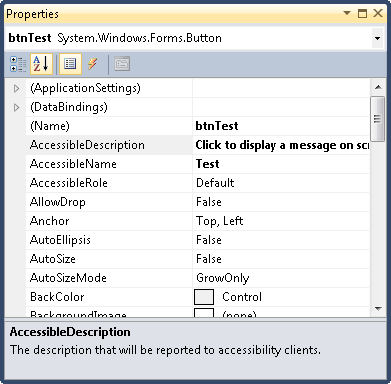
In addition to the ToolTip control, every control has three special accessibility properties as shown here.

Accessibility0201

These properties have specific purposes:


  • AccessibleDescription: A description of how the user should interact with the control. In fact, I normally use the same text as the ToolTip property for this entry and rely on the same rules for creating it.
  • AccessibleName: The name that will be reported to accessibility aids. I normally provide the same text that appears on the control’s caption, minus the ampersand used for the keyboard accelerator.
  • AccessibleRole: The task that the control performs. In most cases, Default works just fine. However, when your control performs an unusual task, you should choose one of the more specific entries so that the accessibility aid can help the user interact with the control.


Make sure you fill out each of the properties so that accessibility aids have the best chance of making your application useful to those who have special needs. In fact, it shouldn’t surprise you to discover that AccessibleRole is already filled out for most controls, so you really only need to fill out two properties in most cases.

The final two changes appear on the form itself. Whenever possible, assign controls to the AcceptButton and CancelButton properties. The AcceptButton provides a means of accepting the content of a dialog box or form by pressing Enter. On the other hand, the CancelButton property makes it possible to reject changes to the form or dialog box by pressing Esc. It’s true that you’ll find situations where you can’t assign a control to one or both properties because there isn’t a default acceptance or cancellation control, but this limitation applies to very few applications.

Accessible applications are significantly easier for everyone to use. Less experienced users can benefit from the inclusion of tooltips. Keyboardists benefit from the presence of keyboard accelerators. Adding these features isn’t difficult or time consuming, so all developers should be adding them.  Let me know your thoughts about accessibility and whether you’d like to see additional accessibility posts at [email protected].


A Visual Studio Quick Guide to Accessibility (Part 1)

One of the most important accessibility aids that also applies to common users is the keyboard accelerator (or keyboard shortcut). In fact, this issue figures prominently in both C# Design and Development and Accessibility for Everybody: Understanding the Section 508 Accessibility Requirements. Just why Microsoft decided to turn this feature off in Windows 7 is a complete mystery to me. All of the pertinent examples in Professional Windows 7 Development Guide include keyboard accelerators, but you can’t see them. I’ve received a number of queries about this problem and decided that this two-part post on accessibility for Visual Studio developers is really necessary.

First, let’s discuss the keyboard accelerator from a programming perspective. A keyboard accelerator is the underline you see on a button, label, menu, or other control. You press Alt+Letter to perform the equivalent of a click or selection with the associated control. For example, most people know that you press Alt+F to access the File menu in an application that has keyboard accelerators properly implemented.

To create a keyboard accelerator, the developer precedes the letter or number with an ampersand (the & character). For example, to make the File menu respond to Alt+F, the developer would type &File in the development environment. I’ve always strongly encouraged the use of keyboard accelerators as a must have for any application because many keyboardists are seriously hindered by an application that lacks them. In fact, you’ll find the keyboard accelerators used in the vast majority of my books, even for examples that aren’t related to programming in any way.

Second, some developers who feel as I do about keyboard accelerators are upset that adding them to applications no longer works (apparently). Windows 7 hides the keyboard accelerators for some odd reason known only to Microsoft. The Ribbon interface provides an equivalent when the developer provides it, but we’re talking about all of the applications (the vast majority) that don’t use the Ribbon interface. It turns out that you must manually turn the keyboard accelerator support back on. Follow this steps to accomplish the task manually:


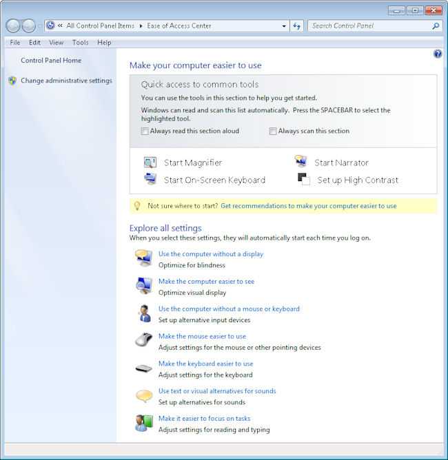
  1. Open the Control Panel, followed by the Ease of Access applet. Click the Ease of Access Enter link. You’ll see the list of options shown here:Accessibility0101
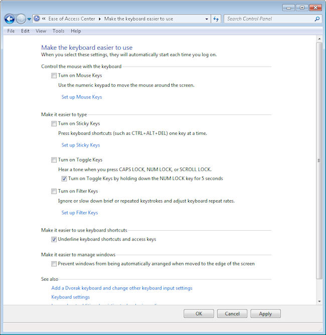
  2. Click Make the Keyboard Easier to Use. You’ll see a list of options for making the keyboard easier to use. Near the bottom of the list you’ll see the Underline Keyboard Shortcuts and Access Keys option shown here.
    Accessibility0102
  3. Check this option and then click OK. The system will now display the underlines as before.

One of the biggest questions I had while working through this is whether there is a method for turning this feature on or off at the command line. There isn’t any WMIC command that I’ve found to make the change (nor any other command for that matter), so I’m currently trying to discover the associated registry keys. I’ve found one so far. The On value in the HKEY_CURRENT_USER\Control Panel\Accessibility\Keyboard Preference key must be changed to 1. However, that value alone doesn’t make the change work, so there are more keys and values to find. If anyone has some clues to provide me about this particular need, please let me know at [email protected]. In the meantime, I’ll continue looking for the elusive registry updates required to automate this change.


Becoming a Programmer

I’ve had more than a few readers write and ask how someone becomes a programmer. Of course, that’s a loaded question. The first thing that you must decide is what a programmer does, who they are as a member of society, and what they contribute to society. There are many fields that could be construed as programming. Anyone who writes a set of instructions that somehow directs that actions of a computer is a programmer. This definition encompasses everyone from the administrator or power user who writes macros to the designer who creates engineers huge projects to the low level developer who creates operating system code. Theoretically, the ingenious person who actually succeeds at programming their video recorder to start and stop at certain times to capture a favorite television show is a kind of programmer. Today I’ll focus on the computer scientist, because that’s what I am.

Aptitude is part of becoming a good computer scientist and you need to decide whether you have the required talents, skills, and desires. A love of the abstract is a requirement. Despite the best efforts of companies such as Oracle and Microsoft (and a huge number of others) to create an environment that mirrors the concrete world, creating good code is the domain of those who embrace the abstract. It isn’t simply a matter of knowing how to work with numbers. A computer scientist is an expert in many arenas of abstract thought and can actually feel the numbers in a way that few others can. Developing great computer applications is an art and many of the best computer scientists have an artistic bentthey play music, craft words into books, paint, or otherwise put into physical existence the abstract concepts of the mind.

Most computer scientists are naturally curious. It isn’t sufficient to know that the device workshow the device works is far more interesting. Taking things apart to see how they work and putting them back together again to ensure a true understanding of the underlying principles exists is a joy for the computer scientist. Nothing is too complex and in everything there is wonder. Where others see the mundane, the computer scientist sees the amazing.

Of course, there is the practical to consider as well. My first exposure to computers and programming was punch cards (yes, I’m dating myself here). I was in a typing class and part of that class was to work on a keypunch machine. The fact that holes in a card could control a huge machine was amazing to me. In those early years I also studied computer hardware in depth (right down to the chemical reactions that occur within a transistor) and discovered things like paper tape machines and light panels. This sort of education isn’t available to aspiring computer scientists today, but it’s where I began. Those early days were critical to my development as a computer scientist. Your early days are equally important.

So, where would someone begin today? There is a fear that everyone seems to exhibit about destroying their computer. Get an older machine that you don’t have to care too deeply about, but still works. Take it apart, learn how it works, and put it back together. A computer scientist understands that every line of code does something to the hardware. We’ve lost touch with that connection todaya real loss. Obviously, you don’t need to know absolutely everything about the functioning of the hardware, but you should at least know the basic parts of your computer.

Start small. If nothing else, install an old version of Office on your machine and use it to write macros. For that matter, try working at the command line for a while and write some batch files for it. You could also try working with JavaScriptit’s free and there are some excellent tutorials for it online. Experience the small things and you’ll gain understanding that you can’t get any other way. Most importantly, keep in mind that you’re trying to affect the world around you by writing commands.

Eventually, you’ll want to start working with a programming language. My first true programming language was BASIC. I learned it at a time when DOS was kingbefore Windows was even a twinkle in Microsoft’s eye. Visual Basic or C# are great languages to start with. You can write some extremely useful applications without a very large investment in either time or money. If you prefer, learning Java can be a good experience, but I’ve found it requires a little more time to learn than some other languages. But if you really wanted to stick with learning Java, as my friend did, you could always follow his lead by deciding to see how assignment guidance, that you can get from somewhere similar to bookwormhub can help you when it comes to completing studies that you may find hard to understand. My friend had many experiences like this, but his life was made much easier after using this service. Since I didn’t use it, I found it quite difficult and time-consuming, but my friend had a completely different experience with it, so you may find it easier to handle than me.

Discover a low level language. For me it was assembler. Actually, I learned to work with assembler on a number of systems. Today you’ll want to learn C++ because few people use assembler anymore. Even embedded system programming (the last frontier of truly custom systems) relies on C or C++ for the most part now.

Don’t confine yourself to a single platform or language though. Before I even entered college, I had been exposed to three different computer languages. During college I learned three more. Today I learn whatever seems to be the best language to accomplish a particular task. It wasn’t long ago that I learned IronPython. I’ve worked with PERL, LISP, F#, Java, PHP, and many other languagesthey’re all ways to express something that I need to do with the computerthey’re all beautiful languages for a particular task.

The important thing is not to make writing applications a chore or workkeep it fun. If you’re thinking about a career as a computer scientist, I think you have some amazing things to look forward to because computers are become ever more capable of interacting with the outside world. Let me know your thoughts about computer science at [email protected].


Using a Horizontal Web Site Layout

A friend recently wrote to me regarding an issue with Web site layout. Of course, I’ve dealt with Web design issues in a number of my booksmost notably C# Design and Development and Accessibility for Everybody: Understanding the Section 508 Accessibility Requirements. If you look at most Web sites today, they all have three serious problems:

  • The line length is too longforcing the eye to work extra hard to read the material because the eye loses track of the line and actually making it tiresome to review the material.
  • The page contains too much material, which makes it tiresome for anyone working with a screen reader to listen to all the material before finding the one bit of information actually required from the site.
  • The use of vertical scrolling is contrary to the historical use of horizontal scrolling. If you look at how people worked with scrolling in ages past, it was always horizontal, making it easier to read the material.

She even sent me two articles that describe the problem in greater detail. The first article is entitled, “Are Horizontal Website Layouts the Wave of the Future?” and points out that research shows that most people don’t even read the excess material on a Web site. If nothing else, the strong research showing that my efforts are being wasted would tend to make me rethink my design. The second article is entitled, “Horizontalism and Readability” and it places more emphasis on the historical approach to horizontal layout, rather than focus on modern research. I tend to prefer tested approaches to presenting information when I can get them (new ideas are fine for someone else to test).

Of course, a Web site is not the same as printed material. Trying to equate the two could very well be a mistake. Here is my take on how the mediums differ:

  • The method of presentation differs. You’re not relying on paper, you’re using a video screen of some sort and that does make a difference in how the reader perceives the material.
  • The environment differs. I don’t usually sit in my easy chair next to the fire when I read materials online. I’m normally in my office in a formal work environment.
  • The approach to reading differs. My paper reading environment is relaxed and long term. It’s nothing for me to spend an entire day reading a good book. My online reading is more like a sprintI find what I need quickly and never read for more than a half hour at a time.
  • The technology differs. When I read a book, I get print in one size. So, if the print is less than appealing or causes eye fatigue, I’m just stuck with it. My browser allows me to change the font size a Web site uses so I can make the print eye friendly. Although, I would still recommend wearing reading glasses if you find that you’re experiencing eye fatigue from staring at a computer screen, but life should be made easier if you can alter the font size. In fact, I can even use a CSS file to change the typeface and other features for some Web sites.

The obvious question now is whether the two environments differ enough that considerations normally made for paper don’t apply to Web sites. My thought is that creating Web sites with smaller amounts of material, eye friendly design, and shorter columns are all great ideas, but I’m not completely sold on the idea of horizontal scrolling. Of course, every person or business has their preference about how they want their website to look, and that’s fine. That is what makes everyone different. Some may decide to design it themselves, whilst others may decide to enlist the help and expertise of somewhere like Plenty of Pixels – Pasadena Website Design to incorporate everything they want to see on their website. As long as you have all the information you need to attract customers, that’s all that matters. But horizontal scrolling? That’s another story entirely. What is your take on this idea. Let me know at [email protected].