A Visual Studio Quick Guide to Accessibility (Part 2)

In my previous post, A Visual Studio Quick Guide to Accessibility (Part 1), I discussed one particularly important accessibility feature. The use of keyboard accelerators is essential because many people use them to improve productivity. Making them visible is important because you can’t use a feature you can’t see. This post won’t cover all of the ideas and concepts for Visual Studio developers found in Accessibility for Everybody: Understanding the Section 508 Accessibility Requirements. However, it does provide an overview of the most essential accessibility featuresthose that every application should have.

The first feature is the tooltip. Every application should include a ToolTip control. You can then provide a description of every user-accessible control in the ToolTip property for that control. It’s important to stress user-accessible in this case. For example, you won’t provide a ToolTip property value for a Label in most cases because the Label simply marks a user-accessible control such as a TextBox. When the user hovers the mouse over the control, the application displays a helpful bit of information about that control. Screen readers used by those with visual needs also read each of the tooltips to describe the controls to the user. A few rules for using the ToolTip control are:


  • Keep the ToolTip text short. Imagine trying to listen to long diatribes about control functionality when working with a screen reader.
  • Make the ToolTip text specific. Tell the user precisely what the control is designed to do.
  • Emphasize the user’s interaction. Tell the user how to interact with the control, such as “Type the message you want displayed.” or “Click to display a message on screen.”


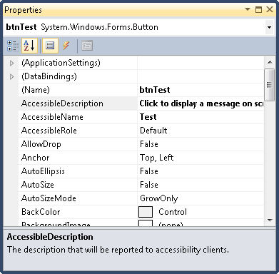
In addition to the ToolTip control, every control has three special accessibility properties as shown here.

Accessibility0201

These properties have specific purposes:


  • AccessibleDescription: A description of how the user should interact with the control. In fact, I normally use the same text as the ToolTip property for this entry and rely on the same rules for creating it.
  • AccessibleName: The name that will be reported to accessibility aids. I normally provide the same text that appears on the control’s caption, minus the ampersand used for the keyboard accelerator.
  • AccessibleRole: The task that the control performs. In most cases, Default works just fine. However, when your control performs an unusual task, you should choose one of the more specific entries so that the accessibility aid can help the user interact with the control.


Make sure you fill out each of the properties so that accessibility aids have the best chance of making your application useful to those who have special needs. In fact, it shouldn’t surprise you to discover that AccessibleRole is already filled out for most controls, so you really only need to fill out two properties in most cases.

The final two changes appear on the form itself. Whenever possible, assign controls to the AcceptButton and CancelButton properties. The AcceptButton provides a means of accepting the content of a dialog box or form by pressing Enter. On the other hand, the CancelButton property makes it possible to reject changes to the form or dialog box by pressing Esc. It’s true that you’ll find situations where you can’t assign a control to one or both properties because there isn’t a default acceptance or cancellation control, but this limitation applies to very few applications.

Accessible applications are significantly easier for everyone to use. Less experienced users can benefit from the inclusion of tooltips. Keyboardists benefit from the presence of keyboard accelerators. Adding these features isn’t difficult or time consuming, so all developers should be adding them.  Let me know your thoughts about accessibility and whether you’d like to see additional accessibility posts at [email protected].


A Visual Studio Quick Guide to Accessibility (Part 1)

One of the most important accessibility aids that also applies to common users is the keyboard accelerator (or keyboard shortcut). In fact, this issue figures prominently in both C# Design and Development and Accessibility for Everybody: Understanding the Section 508 Accessibility Requirements. Just why Microsoft decided to turn this feature off in Windows 7 is a complete mystery to me. All of the pertinent examples in Professional Windows 7 Development Guide include keyboard accelerators, but you can’t see them. I’ve received a number of queries about this problem and decided that this two-part post on accessibility for Visual Studio developers is really necessary.

First, let’s discuss the keyboard accelerator from a programming perspective. A keyboard accelerator is the underline you see on a button, label, menu, or other control. You press Alt+Letter to perform the equivalent of a click or selection with the associated control. For example, most people know that you press Alt+F to access the File menu in an application that has keyboard accelerators properly implemented.

To create a keyboard accelerator, the developer precedes the letter or number with an ampersand (the & character). For example, to make the File menu respond to Alt+F, the developer would type &File in the development environment. I’ve always strongly encouraged the use of keyboard accelerators as a must have for any application because many keyboardists are seriously hindered by an application that lacks them. In fact, you’ll find the keyboard accelerators used in the vast majority of my books, even for examples that aren’t related to programming in any way.

Second, some developers who feel as I do about keyboard accelerators are upset that adding them to applications no longer works (apparently). Windows 7 hides the keyboard accelerators for some odd reason known only to Microsoft. The Ribbon interface provides an equivalent when the developer provides it, but we’re talking about all of the applications (the vast majority) that don’t use the Ribbon interface. It turns out that you must manually turn the keyboard accelerator support back on. Follow this steps to accomplish the task manually:


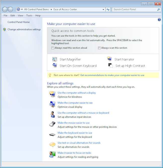
  1. Open the Control Panel, followed by the Ease of Access applet. Click the Ease of Access Enter link. You’ll see the list of options shown here:Accessibility0101
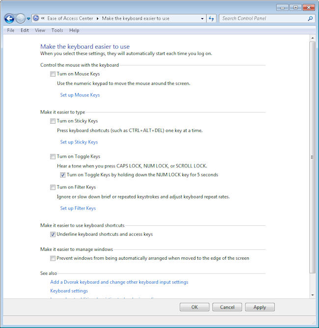
  2. Click Make the Keyboard Easier to Use. You’ll see a list of options for making the keyboard easier to use. Near the bottom of the list you’ll see the Underline Keyboard Shortcuts and Access Keys option shown here.
    Accessibility0102
  3. Check this option and then click OK. The system will now display the underlines as before.

One of the biggest questions I had while working through this is whether there is a method for turning this feature on or off at the command line. There isn’t any WMIC command that I’ve found to make the change (nor any other command for that matter), so I’m currently trying to discover the associated registry keys. I’ve found one so far. The On value in the HKEY_CURRENT_USER\Control Panel\Accessibility\Keyboard Preference key must be changed to 1. However, that value alone doesn’t make the change work, so there are more keys and values to find. If anyone has some clues to provide me about this particular need, please let me know at [email protected]. In the meantime, I’ll continue looking for the elusive registry updates required to automate this change.


Robotics in Your Future

I’ve mentioned more than once that I’m intensely interested in accessibility in all its forms. In fact, in my view, one of the most important uses of computer systems is to make life easier for people with special needs. Eventually, we all experience a special need. If nothing else, age tends to rob us of mobility and the use of our senses, making some form of aid imperative.

Of course, most people are aware of robots. I read Asimov books such as, “I, Robot” with great interest as I grew up because like Asimov, I saw the huge potential of robots in a number of ventures. The first venture I became aware of was in industrial automationpainting cars I believe. Painting cars was only the beginning. Today, we couldn’t explore space successfully without robots, and the industry continues to grow, with companies like Google and Uber looking at self-driving cars. Many businesses are turning to industrial automated systems to aid with various parts of their companies, so it doesn’t seem as if they are going to stop anytime soon. If you are interested in learning more about industrial automation, click here.

All of these uses for robots are nice. However, the use that really piques my imagination is the use of robotic technology to help people in ways that we couldn’t even imagine just a few years ago. I’ve read with great interest about the use of exoskeletons for military personnel. Then, when the press started talking about the use of exoskeleton technology for the space program, I got really excited. However, a news story I read yesterday fulfills a promise for exoskeleton technology that I’ve always wanted to read about. In this case, a paralyzed student has been able to walk again. Amazing!

The technology still requires a lot of work, but I foresee a time when exoskeletons will make it possible for someone with just about any severe injury to lead a completely normal life. You won’t see someone who is struggling just to get by anymore; you’ll see someone who looks like absolutely everyone else. I can’t imagine a better use of technology to meet the needs of people who require it.

As with any technology, there are going to be abuses of this one. It’s unfortunate, but someone will find ways to use this technology in ways that actually hurt other humans or the person employing the technology. What good uses for this technology can you think about? What are the potential bad uses that come to mind? Let me know at [email protected].

Using a Horizontal Web Site Layout

A friend recently wrote to me regarding an issue with Web site layout. Of course, I’ve dealt with Web design issues in a number of my booksmost notably C# Design and Development and Accessibility for Everybody: Understanding the Section 508 Accessibility Requirements. If you look at most Web sites today, they all have three serious problems:

  • The line length is too longforcing the eye to work extra hard to read the material because the eye loses track of the line and actually making it tiresome to review the material.
  • The page contains too much material, which makes it tiresome for anyone working with a screen reader to listen to all the material before finding the one bit of information actually required from the site.
  • The use of vertical scrolling is contrary to the historical use of horizontal scrolling. If you look at how people worked with scrolling in ages past, it was always horizontal, making it easier to read the material.

She even sent me two articles that describe the problem in greater detail. The first article is entitled, “Are Horizontal Website Layouts the Wave of the Future?” and points out that research shows that most people don’t even read the excess material on a Web site. If nothing else, the strong research showing that my efforts are being wasted would tend to make me rethink my design. The second article is entitled, “Horizontalism and Readability” and it places more emphasis on the historical approach to horizontal layout, rather than focus on modern research. I tend to prefer tested approaches to presenting information when I can get them (new ideas are fine for someone else to test).

Of course, a Web site is not the same as printed material. Trying to equate the two could very well be a mistake. Here is my take on how the mediums differ:

  • The method of presentation differs. You’re not relying on paper, you’re using a video screen of some sort and that does make a difference in how the reader perceives the material.
  • The environment differs. I don’t usually sit in my easy chair next to the fire when I read materials online. I’m normally in my office in a formal work environment.
  • The approach to reading differs. My paper reading environment is relaxed and long term. It’s nothing for me to spend an entire day reading a good book. My online reading is more like a sprintI find what I need quickly and never read for more than a half hour at a time.
  • The technology differs. When I read a book, I get print in one size. So, if the print is less than appealing or causes eye fatigue, I’m just stuck with it. My browser allows me to change the font size a Web site uses so I can make the print eye friendly. Although, I would still recommend wearing reading glasses if you find that you’re experiencing eye fatigue from staring at a computer screen, but life should be made easier if you can alter the font size. In fact, I can even use a CSS file to change the typeface and other features for some Web sites.

The obvious question now is whether the two environments differ enough that considerations normally made for paper don’t apply to Web sites. My thought is that creating Web sites with smaller amounts of material, eye friendly design, and shorter columns are all great ideas, but I’m not completely sold on the idea of horizontal scrolling. Of course, every person or business has their preference about how they want their website to look, and that’s fine. That is what makes everyone different. Some may decide to design it themselves, whilst others may decide to enlist the help and expertise of somewhere like Plenty of Pixels – Pasadena Website Design to incorporate everything they want to see on their website. As long as you have all the information you need to attract customers, that’s all that matters. But horizontal scrolling? That’s another story entirely. What is your take on this idea. Let me know at [email protected].

Considering the Economics of Accessibility

People have asked in the past which book of mine is my favorite. I have a number of answers to that question. In one respect or another, all of my books are my favorite because they all answer different questions and help a different group of people. As I’ve mentioned in the past, the reason I write is because I truly enjoy helping others.

My reasons for writing “Accessibility for Everybody: Understanding the Section 508 Accessibility Requirements” are many. However, one of the biggest reasons that I wrote it is because there are good economic reasons to make applications accessible to everyone. Not all of these reasons have a direct monetary impact, but I do express them in the first chapter of the book. The fact of the matter is that if your application isn’t accessible, you’re costing your company time and money. If you’re a store owner, you’re losing money every second that your organization uses applications that aren’t accessible.

Many
people associate accessibility with those who have special visual or
audio needs.  However, accessibility affects quite a large group of
people, including those who are colorblind. Did you realize that about 8% of the male population is colorblind,
which means that if your application isn’t accessible to this group
that you’re losing out on 8% of your sales right off the top? Can you
really miss out on that many sales? In short, accessibility is truly for everyone and everyone includes you.

It amazes me that some organizations just don’t seem to get it. Accessibility affects more than those people across the street; they affect you personally. At some point in life, you’re going to need an accessibility aid. Our eyes get older and can’t see as well, the ears refuse to hear, things wear out. So, the accessibility features you add to an application today will ultimately help you in some way. It’s the reason that I read about lawsuits such as the one between the National Federation of the Blind, NFB, and Google, and have to scratch my head. I have to wonder why such a lawsuit is even necessary.

Another reason I wrote my book is to show how easy it is to make applications accessible and to inform my readers about the laws regarding accessibility (laws that our government doesn’t enforce).  Creating an accessible application with the tools available today isn’t a major undertaking. In many cases you’re looking at a few extra minutes to add features such as speed keys and titles that a screen reader can read (the same titles appear as balloon help that sighted users also rely upon). It’s true that applications that make heavy use of full animation or video can become harder to make accessible, but these applications are in the minority. Most business applications require very little extra work.

If you think buying a book to learn about accessibility is just too expensive, I encourage you to make use of the free resources available on the Internet. Companies such as Microsoft want you to create accessible applications because they realize that it’s in their best interest to do so. These resources are incredibly easy to use and they make life easier for everyone. I’m always happy to hear about your insights regarding accessibility, so feel free to contact me at [email protected].


A Potential Eye Gaze System Replacement

I view the computer as a great equalizer. People who have special needs can rely on a computer to give them access to the world at large and make them productive citizens. In fact, I’m often amazed at what a computer can do in the right hands. People who used to be locked away in institutions are now living independently with help from their computer. That’s why I read a ComputerWorld article today, “Look, no hands! G.tec uses brain interface to tweet” with great interest. I don’t think this system could replace eye gaze systems for those who need them today, but the system holds great potential as an eye gaze system replacement in the future.

So, just what is an eye gaze system? Imagine you have two cameras mounted on either side of a monitor. The cameras are focused on someone’s eye position. As the person moves their eyes to look at a letter on a card above the monitor, the cameras record the position and use the information to tell the computer what letter to type. Of course, eye gaze systems can be used for more than simply typing letters. Some of these systems are extremely complex and can record the viewer’s gaze at any position on the monitor. Check out the LC Technologies setup as a modern example of what an eye gaze system can do.

The problem with eye gaze systems is that they can be slow, error prone, and tiring to use. Unless the system is properly calibrated, using eye gaze to interact with a computer can become frustrating and time consuming. This brain computer interface is exciting because it promises higher speed (0.9 seconds once trained) and the potential for errors is greatly reduced. However, this system is still in its infancy, so eye gaze systems will continue to be important for people with special needs well into the future. You can read more about accessibility topics in my book, “Accessibility for Everybody: Understanding the Section 508 Accessibility Requirements.” Let me know what you think of this new technology at [email protected].